– Performance Improvements
National Bank
Despite lacking a dedicated research budget and direct access to the bank’s clients, we increased conversion rates by 325% and reduced the average time to convert by 22% in National Bank’s investment onboarding flow.
Role
Design Lead
Platform
Web App
Year
2024
Duration
1 Month
Uh oh, the application is underperforming 😱
Conversion rates are far below the bank's internal targets. The average time to conversion is also below industry standards. This is costing the bank customers and revenue everyday.
What could be causing performance issues?
So, why is the application is performing so poorly? We dug into the Mixpanel data to find a starting point or trend to help us begin our investigation. Here's what we found:
✔️ There was no difference in drop-offs across screen sizes, device types or languages
✔️ Key sections had significantly higher drop-off rates than others
✔️ Users were spending a lot of time on key tasks within the flow
✔️ Drop-offs remained consistent in traditional spike periods (RRSP season)
So, why is the application is performing so poorly? We dug into the Mixpanel data to find a starting point or trend to help us begin our investigation. Here's what we found:
✔️ There was no difference in drop-offs across screen sizes, device types or languages
✔️ Key sections in the flow had significantly higher drop-off rates than others
✔️ Users were spending a good deal of time on certain key tasks within the flow
✔️ Drop-offs remained stable in traditional spike periods for investment (RRSP season)
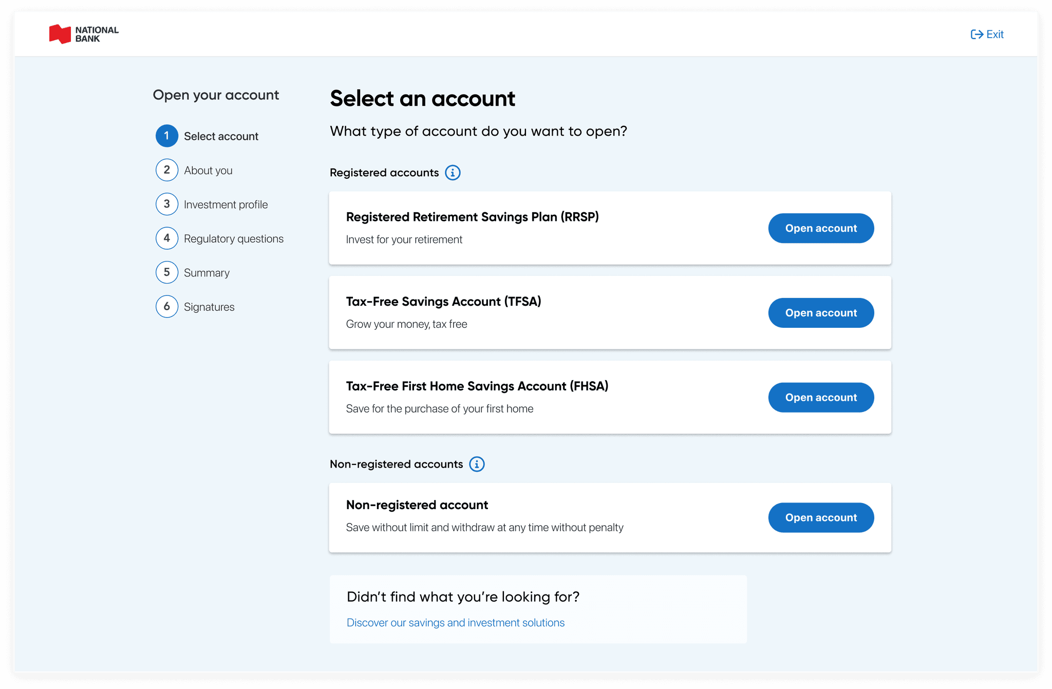
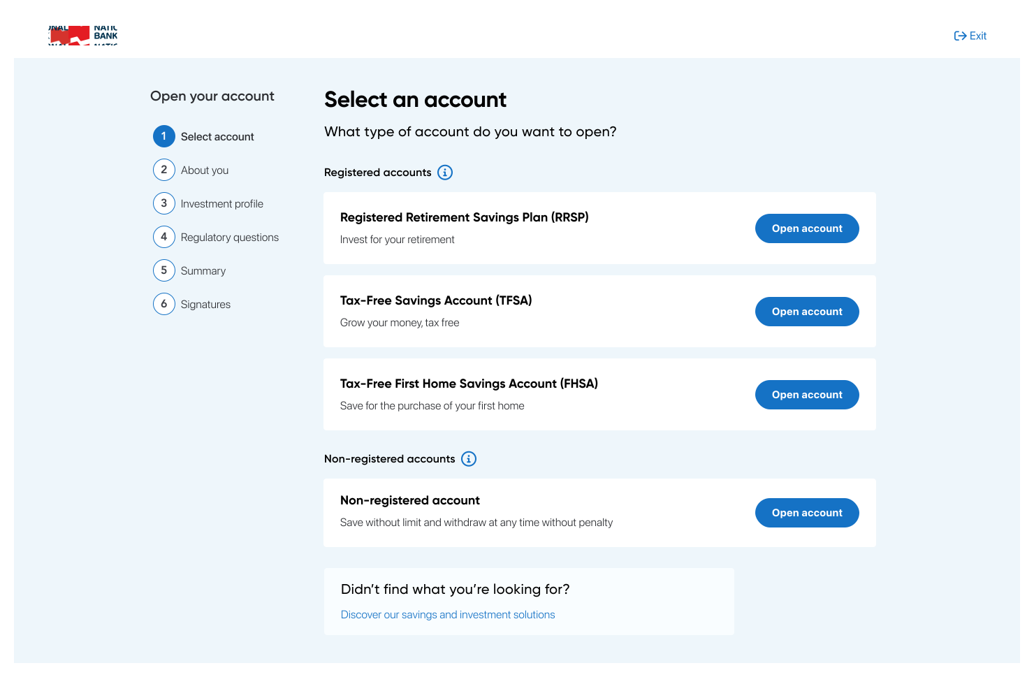
Are we describing account options the best we can?
The descriptions for account types seem like they could be tripping up users with their length and specificity. Perhaps shorter, more actionable language would help?
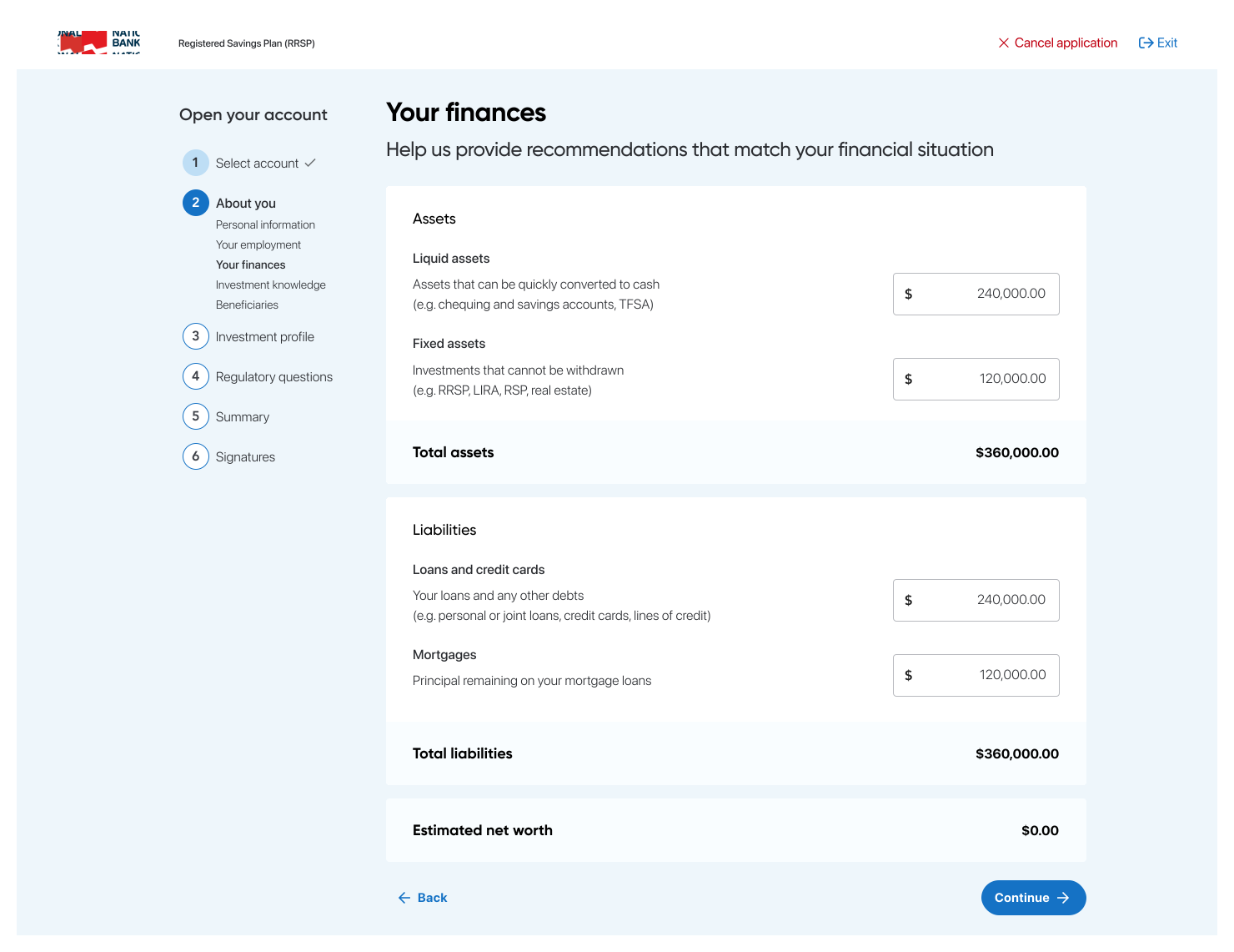
Are our layouts, components and copywriting providing clarity?
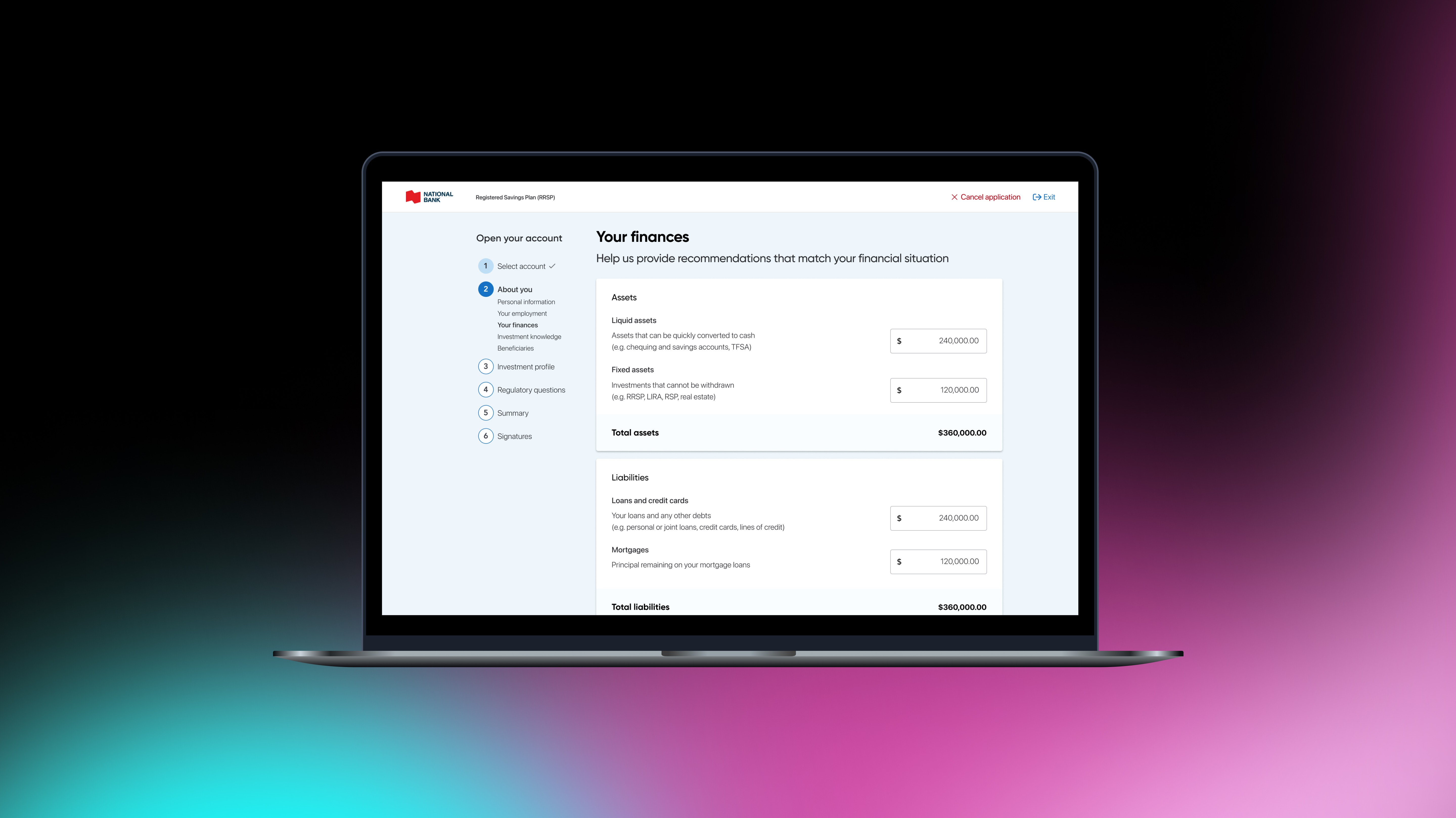
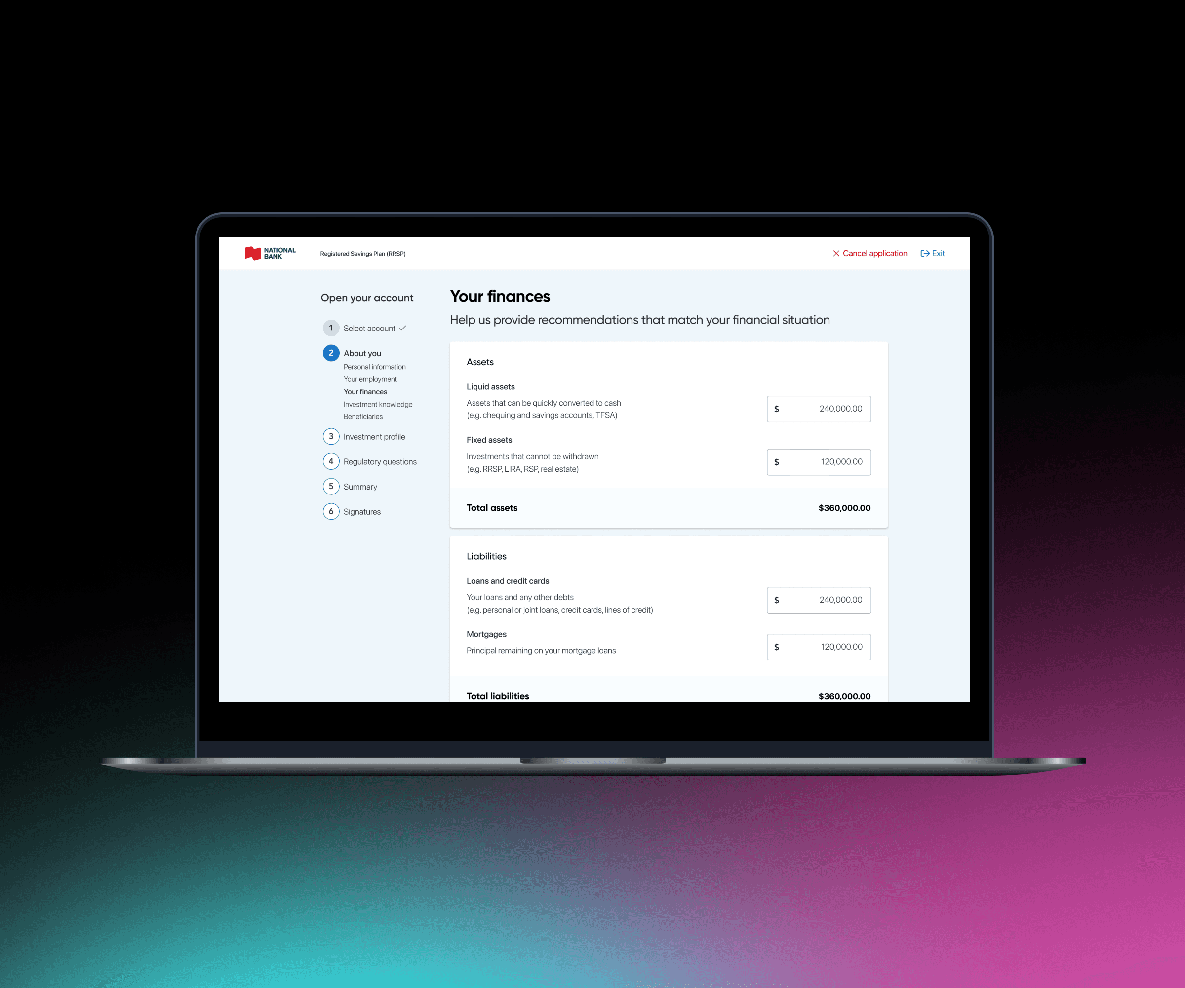
This section currently has multiple card layers, permanently disabled fields and confusing, front-loaded sentences. These reduce clarity and slow users down.
Are users aware they are about to be re-directed outside of the application?
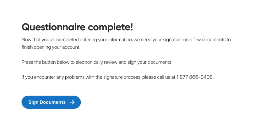
Redirecting users outside the application can cause friction and increase drop-offs. It's crucial to inform and reassure users at this stage to ensure a smooth experience.
Why are we referencing defunct functionality? Could we improve our CTA?
The next steps reference removed features, wasting an opportunity to present a clear CTA on a key screen. Improving this can help users take their next action and increase revenue.
Taking a look at potential issues 👀
Are we describing account options the best we can?
The descriptions for various account types seem like they could be tripping up users with their length and specificity. Perhaps shorter, more actionable language would help?
Are our layouts, components and copywriting providing clarity?
This section currently has multiple card layers, permanently disabled fields and confusing, front-loaded sentences. These elements reduce clarity and slow users down.
Are users aware they are about to be re-directed outside of the application?
Redirecting users outside the application can cause friction and increase drop-offs. It's crucial to inform and reassure users at this stage to ensure a smooth experience.
Why are we referencing defunct functionality? Could we improve our CTA?
The next steps reference removed features, wasting an opportunity to present a clear CTA on a key screen. Improving this can help users take their next action and increase revenue.
Learning through testing and iterating 👨🔬
To avoid assumptions, we conducted usability testing with 10 users on the existing application and potential redesigns. Here's what we found:
To avoid assumptions, we conducted usability testing with 10 users on the existing application and also on potential redesigns. Here's what we found:
Long loading times and poor system feedback
The application's APIs are causing long loading times, leaving users stuck on a loading wheel and unsure if the system is broken. This could be having a significant impact across a multi-step process that has numerous API calls.
Verbose and esoteric copywriting
Users found the copywriting overly lengthy and unclear, particularly on the account selection screen. Detailed mentions of tax considerations and contribution limits overwhelmed and confused them.
Poor visual hierarchy and communication
Poor layouts and visual hierarchies confused users and slowed them down, especially on key steps like when providing financial information or being redirected to DocuSign.
References to non-existent features and workflows
Multiple references to features and workflows that no longer exist caused serious confusion among users, wasting valuable screen space that could be better utilized.
Multiple references to features and that no longer exist caused serious confusion among users, wasting valuable screen space that could be better utilized.
Managing perception of loading times
Given the limitations in reducing long loading times caused by external APIs, we focused on managing user perception of speed. Transitioning from loading wheels to skeleton screens with a slow shimmer creates the illusion of shorter wait times and reassures users that the application is still active, preventing them from thinking it's broken.
Selling our recommendations
The application is built according to prescriptive bank requirements. Any changes required the approval of their content and compliance teams. Our strategy to present our recommendations included:
✔️ Presenting a united front with many voices
✔️ Using data from testing to strengthen our case
✔️ Anticipating objections and having responses prepared
✔️ Welcoming input and demonstrating a deep understanding of the business context
Our changes were a success 🙌
Shoutout to my teammates 🤝
The success of this project wouldn't have been possible without the collaboration and contributions of Riley Szulc, the best product manager a designer could ever work with.
What comes next?
Streamlining with a summary view
Fewer steps with a new summary view
In one future improvement, we aim to reduce the number of steps for existing customers when opening an account. Instead of guiding users through multiple steps, we consolidate relevant details into a read-only view, with an option for users to edit details inline.
In one future improvement involves reducing the number of steps an existing customer would have to take when opening an account. If we have certain details already on file, instead of forcing the user through several steps, we consolidate them into a read only summary view with an option to edit in-line.
Reducing scrolling with a jump to the bottom
Consolidating sections into a read-only summary view results in a page with considerable scroll length. To expedite account creation, we're giving users the ability to jump to the bottom of the page.
Shoutout to my teammates 🤝
The success of this project wouldn't have been possible without the collaboration and contributions of Riley Szulc, the best product manager a designer could ever work with.